📅 Posted 2019-02-01
I’ve noticed a general trend towards more mobile users, but I think it would be good to quantify this. After all, developing websites purely on desktop is definitely easier but probably misguided.
The following mini-analysis is based on my corner of the Internet: not amazingly high traffic sites, but sites which are important to me none-the-less. The source for my numbers is Google Analytics.
The Comparisons
Here’s 4 very different websites compared.
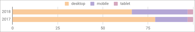
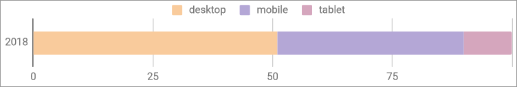
A technology-skewed blogging site (this one)
Stats for my site, which is most often about tech but also other random things when I feel inspired.
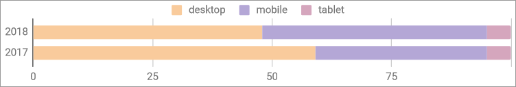
A history and place names website (hawkesbury.org)
The biggest site for tablets, even though they still don’t have a huge market share. I put this down to the older audience who would more likely read such a website - browsing around the web on a tablet probably makes a lot of sense!
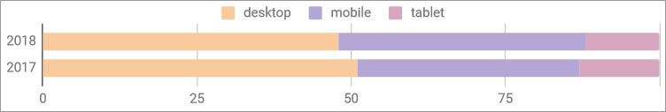
A dental website
A reasonably popular website for a single dental practice shows that the market is moving mobile and at a pretty fast rate.
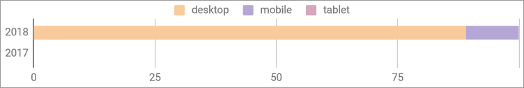
A CMS web app
This web app isn’t brilliant on mobile, but it is used occasionally and does respond down to the small screen generally OK. No data for 2017 because it didn’t really have tracking then and was only in the early stages of development!
Some Observations
- Mobiles are progressively becoming more popular
- Tech blog sites are more desktop-centric
- Tablets are pretty stable, but never really a major stake in the game
What if Google Analytics isn’t a great source?
I tried an alternative source for those who block JS, JS trackers or just Google Analytics generally. I can understand why, but it does make comparisons like this difficult. CloudFront to the rescue!
Unfortunately, CloudFront only gives me 2 months worth of data, but it’s better than nothing. The conclusion is… well, the numbers are pretty similar when compared as percentages. So I’m going to continue to trust these numbers in Google Analytics, at least for now.
How about more of the web?
What about other sites which are far more busy than my examples? Well, I took a quick look at Australia in February 2018 for a quick comparison.
Source: https://kinskiandbourke.com/desktop-vs-mobile-vs-tablet-market-share-australia/
Like this post? Subscribe to my RSS Feed ![]() or
or ![]() Buy me a coffee
Buy me a coffee
Comments are closed